Crafting the Identity of Kaika
Joanna developed the brand identity for Kaika, a premium uni (sea urchin) brand under Urchinomics. From logo and typography to visual language to the website, she crafted a cohesive identity tailored to the North American East Coast Green Urchin market. Designed for Michelin-starred restaurants, Kaika ensures a sustainable, high-quality supply of uni with a strong visual and strategic presence.
A Refined Aesthetic for a Premium Brand
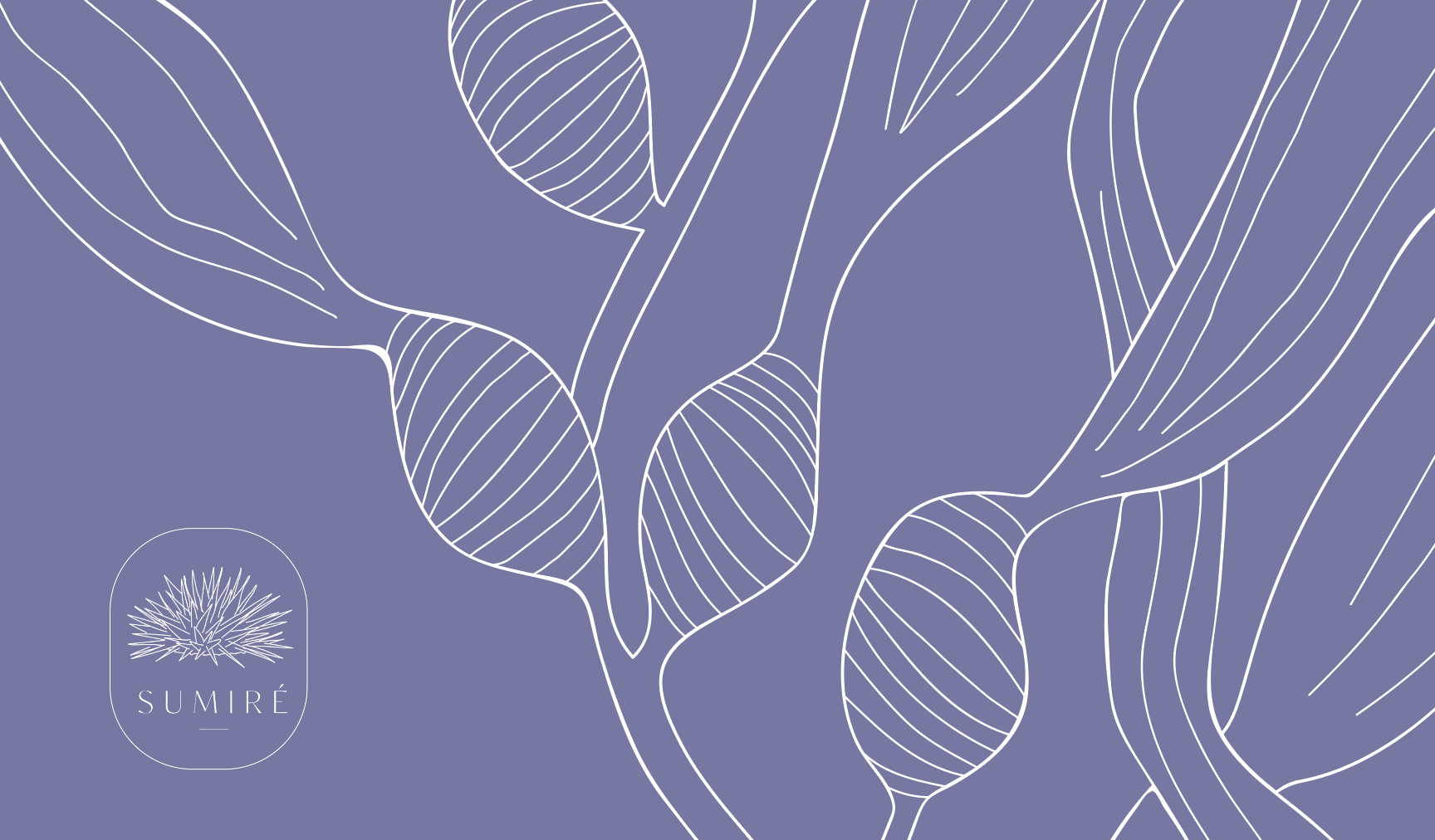
The visual language was thoughtfully developed to balance elegance and sustainability, ensuring that every touchpoint—from packaging to digital presence—embodied the brand’s premium nature. Joanna’s work carefully considered the nuances of the market, creating a look and feel that speaks to both culinary excellence and environmental responsibility.
Urchinomics: Restoring Oceans, One Urchin at a Time
Urchinomics helps restore marine ecosystems by removing overgrazing sea urchins, allowing kelp forests to regenerate—growing up to 18 inches per day. These forests are vital for marine life and global oxygen production, as more than half of the oxygen we breathe comes from the ocean. By transforming empty seafloors into thriving habitats, Urchinomics supports a healthier planet while delivering premium ranched sea urchins to top restaurants worldwide.
TEAM
Creative Director: Joanna Swanson
Illustration: Lina Segerstedt
Client: Urchinomics
Denise Macdonald & Brian Tsuyoshi Takeda
While she also designed the identity for Sumire, Urchinomics’ West Coast brand, the focus here is on Kaika, showcasing a refined aesthetic tailored to an exclusive clientele. Logo below.


